Hamon updates
Most changes are in the Hamon theme, which is a good sign.
Each post ends with links to three similar posts. Similarity is currently measured by tag intersection. It works surprisingly well but requires thinking about how to tag articles.
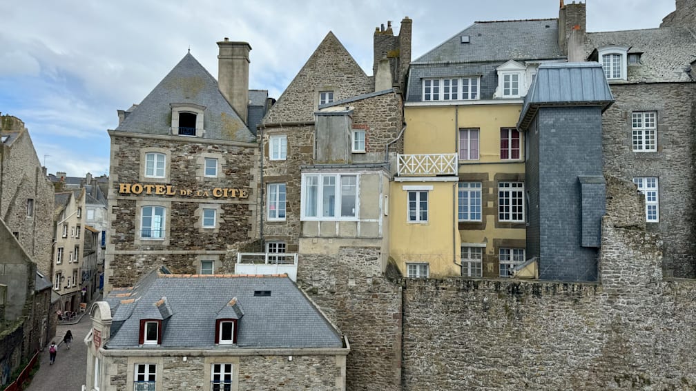
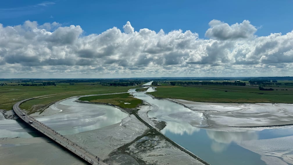
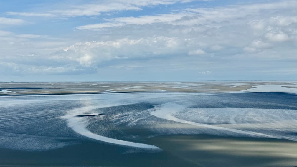
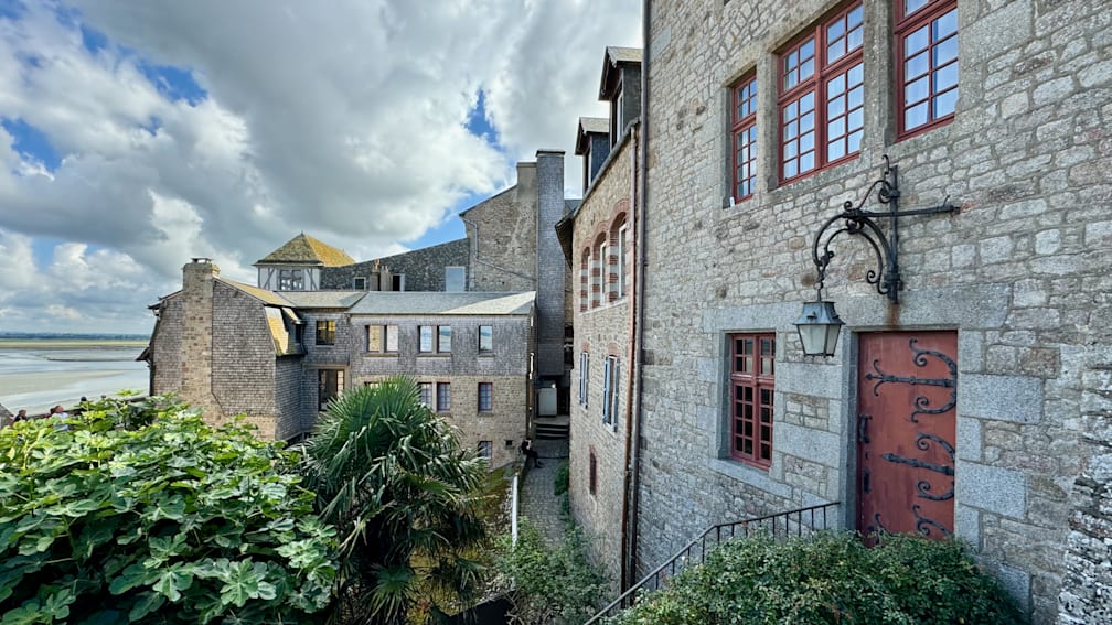
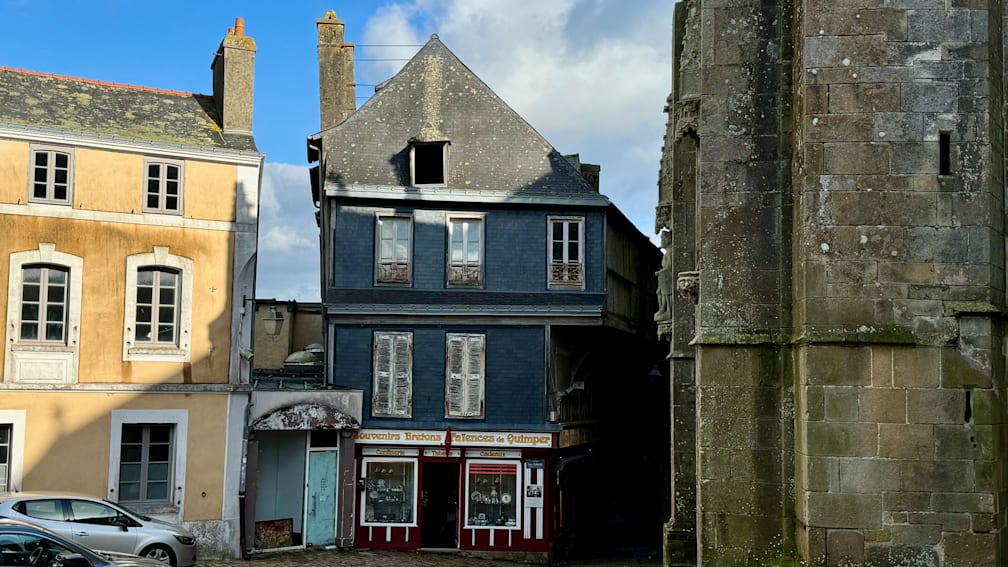
Long-time requested feature - images in postcards are clickable 🎉.
Another long-time requested feature is sticky navigation. Each page now has it. The title comes from the Bar configuration. The post page shows the first tag. Both are links, but they do not look like them. I don’t know if that is okay. My gut feeling says that, at this point, this type of navigation is so widespread that it is clear. I will wait for feedback.
There are also various other little improvements here and there, like consistent rounding and indentation, fixed footer positioning, improved HTML structure, etc.
One more thing. Unfortunately, there is JavaScript. Since there is no way to enter fullscreen mode without JS, the
Hamon theme now contains four lines of
JS code. Here is a
gallery with a few months of foto roll. Look at the ⛶ sign in the bottom-right corner.
I am still not in love with templating language, but in general I really like the result.


